
By Ryan P. Burge, Eastern Illinois University
One of the most powerful sources of data for a scholar of religion and politics is the General Social Survey. It’s a terrific tool for two primary reasons:
- It’s been used for a long time. The first wave was conducted in 1972. This gives social scientists tremendous insight into how things have changed over a long period of time.
- It asks the same religion questions in the same way, every time. The GSS is a kind of gold standard for religious classification because it not only asks what type of church a respondent attends, it follows up on the anby asking for which specific denomination. For example, if someone indicates that they are Baptist, they are then asked, “Is that Southern Baptist, American Baptist, etc.”
These two features give a researcher a tremendous ability to track the political inclinations of religious groups over four and a half decades. So, I thought I would do that.
While there have been many attempts at trying to classify religious individuals into groups (see Hackett and Lindsay 2008 for a great summary), the most widely used and respected approach is RELTRAD. This puts everyone into seven groups: Evangelical Protestant, Mainline Protestant, Black Protestant, Catholic, Jewish, Other Faith, and No Faith. It’s not perfect, and we have written about that before on Religion in Public, but it’s the best we have.[1]
The variable to track partisanship is what is commonly described as seven-point party identification. Each respondent is asked: “Generally speaking, do you usually think of yourself as:” and then they are given seven options ranging from “Strong Democrat” to “Strong Republican” with the middle option being “Independent.” What is displayed below is how the mean score for each of the seven religious traditions has changed over the last 44 years.
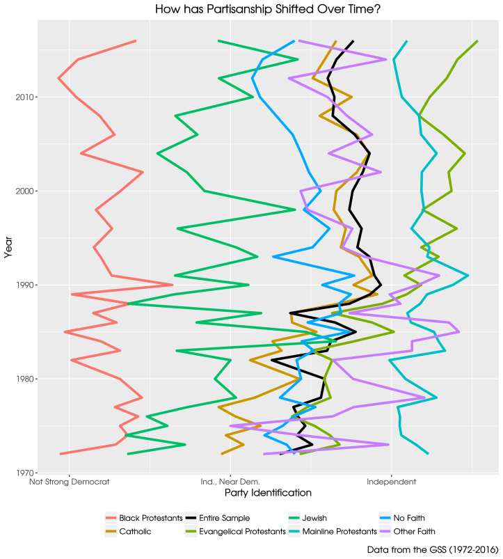
There is a lot to unpack here. First all groups fall slightly left of center. The claim: “We are a center right nation” is all over the internet, but these data don’t support that conclusion. The black line in the graph indicates the mean party identification for all respondents. It’s probably overblown to say that the U.S. is a center left nation, because the groups that are the most liberal in this graph, Black Protestants and Jews, only make up a small percentage of the general population. But, the data do indicate that the American public is generally centrist, certainly not to the right of center.
Several of the groups show interesting trends over time. There is a tremendous amount of stability in the ideology of Mainline Protestants, those of no faith, and Black Protestants. While each of these three groups have seen shifts over the four decades observed, they stayed within a fairly narrow range of values.
Mainline Protestants are worth highlighting. In 1972 they were the most Republican religious tradition by a wide margin. Their placement on the party ID scale has not changed significantly. But, evangelicals have made a dramatic move to the right which began in the early 1980s and continues to 2016. This fits the narrative of the rise of the Religious Right. What is easy to overlook, however, is that evangelicals were actually trending toward the Democrats during the middle of George W. Bush’s presidency. With the election of Barack Obama in 2008 they began to move toward the Republican Party. The evangelicals of 2016 stand as the most Republican religious tradition in the history of the GSS.
Catholics provide another interesting storyline. The time period of 1982 to 1990 show strikingly similar movement among Catholics and evangelicals. This is when American politics became fixated on culture war issues, and the issue of abortion took center stage. However, while evangelicals continued their rightward drift after 1990, Catholics moved very little from their position on the scale in between independent and leaning Democratic.
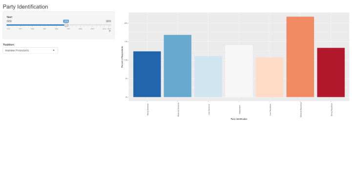
If you would like to explore this data on your own, I have developed a Shiny app which allows you to pick a religious tradition as well as select a year and see how the party ideology responses are distributed in a histogram. There’s also the option to hit the “play” button and watch a tradition’s partisan distribution change over the entire time period. A screenshot of the app is below, but a link is available here. Note that some years are missing from the GSS and therefore no graph will be produced.
The data and the syntax for the analysis can be found on my Github.
Ryan P. Burge teaches at Eastern Illinois University in Charleston, Illinois. He can be contacted via Twitter or his personal website.
[1] I will be using the updated RELTRAD coding which Ed Stetzer and I described in this article.

[…] I also wanted to take a look at how literalists look politically in each of the seven religious traditions. What is displayed below is just the LOESS line without the data points or standard errors in order to see the trend more clearly (here’s the graph with those items added). The y-axis reflects the percentage of respondents who espoused a Republican partisanship in the seven point party id question (including those who “lean Republican”) which is more thoroughly described in a previous post. […]
LikeLike